Company uses blending and layering to incorporate trends into its schemes that fit with client briefs
Subscribe to our free Wharf Whispers newsletter here
Refurbishing and updating the interior of a property can have myriad benefits.
The process offers owner-occupiers the chance to enjoy and use their home to its full potential while adding value should they wish to sell in the future.
For landlords, it’s an opportunity to boost and extend the appeal of their asset to attract more affluent tenants.
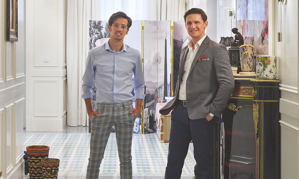
Interior design specialists Paul Cuschieri and Malcolm Abela Sciberras have expanded their business to London, having established Rebirth in Malta.
Here we look at three of their projects that typify their approach when working for clients in the field.
“This property is a mid-century London apartment,” said Paul.
“With us, it’s all about discussing briefs, budget, timelines, style and the needs of our client.
“In this particular project we were tasked with creating a home away from home for our client, but with the possibility of it being rented out.
“This two-bedroom home was dated, worn and tacky, so we had to bring it up to modern standards.
“Efficiency and energy conservation were also very important, so we installed double glazing and changed the central heating system to one that uses less fuel.
“We also made sure the property was in line with all relevant regulations for rental homes.
“Once all these things were set, we went into the design of the space.
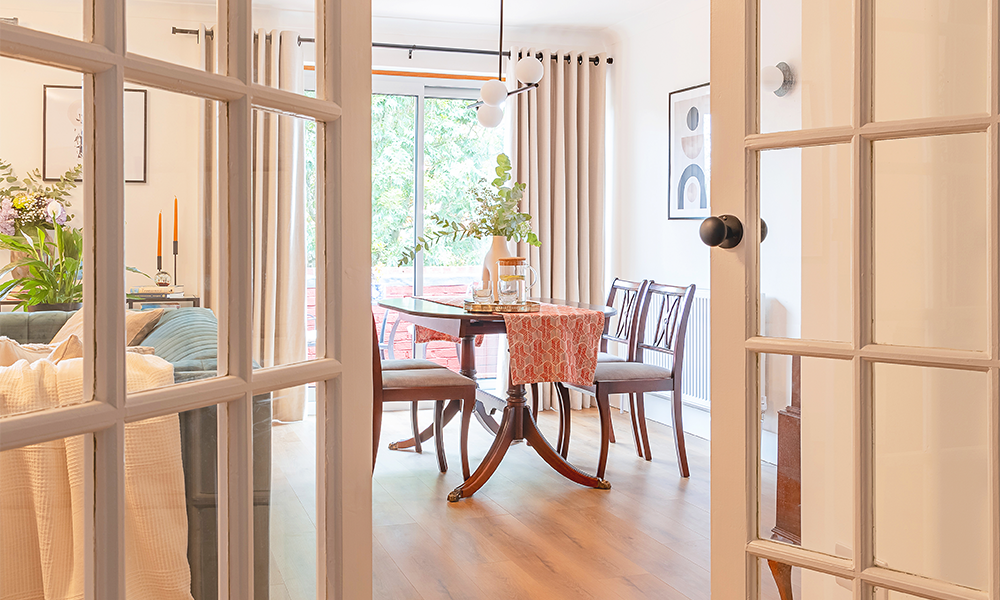
“We recommended going for a minimalist, eclectic feel that’s common to many of our projects. The reason is that we layer the space, creating points of interest.”
This approach allowed Rebirth to take existing statement pieces from the property and build them into their scheme.
Malcolm said: “It gives the place more character, with different features making it feel a bit homelike.
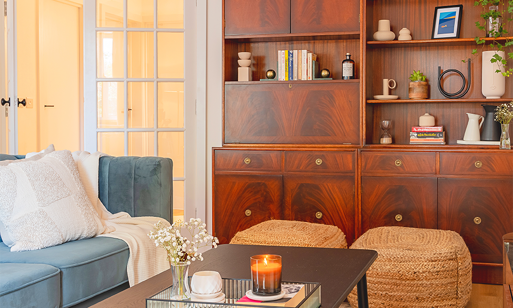
“Our approach also enables us to include any pieces of furniture a client may want to keep and that can be restored if necessary before being incorporated into the design.
“For example, here the dining table and the chairs, a desk and a wall unit were brought back into the final design accordingly so the living area still has those elements.”
Much of the interior on the three-month project, however, was newly installed, with Rebirth also dressing the apartment ready for rental.
“Having worked with the client during the whole process, obviously it becomes easier for us to select items that make the apartment feel like somewhere they would be comfortable living,” said Malcolm.
Paul added: “The architectural elements of the space did not convey bombast – they are a bit minimalist and we wanted to respect this and the era the apartment was built in.
“We were also inspired by the feeling that the place gave us.
“Our design aims to be timeless so it will age well and it’s also very neat.
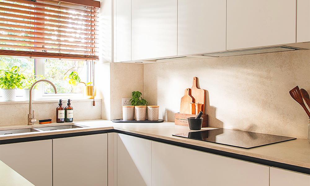
“The kitchen units hide the new boiler system very well and the appliances are beautifully integrated, making the space feel less cluttered.
“That’s important because rental properties need to appeal to as many people as possible.
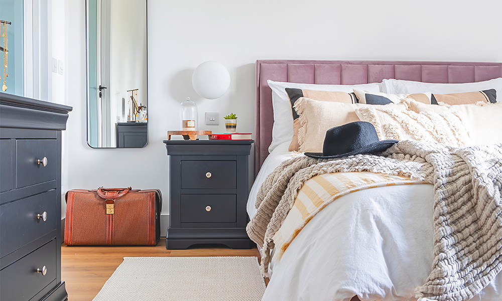
“We use layering to make our interiors feel as though they’ve been there since the beginning, rather than having designs which look too clinical that people can’t relate to.
“The principal bedroom, for example, features darker colours with a masculine feel, but softer furniture with more feminine elements to broaden its appeal.
“We wanted to make it so that when moving from room to room, each would be aligned to the overall feel of the place.
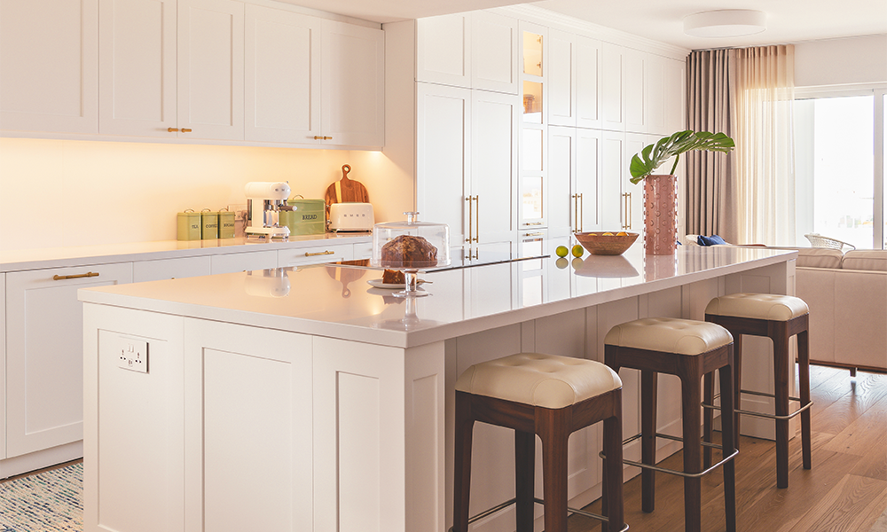
>> Functionality and versatility were the two watchwords for Rebirth when it came to the scheme for this three-bedroom apartment in the company’s native Malta.
Cupboards and doors to conceal functional elements are everywhere in this property hiding an oak-panelled cloakroom, for example.
“The palette is white, white, white, so we wanted to break that down with warm materials, such as bronze or brass accents,” said Paul.
“It has a certain formality but it’s still comfortable.
“One of the things we do when it comes to trends – and at the moment, minimalism is on trend – is to adapt them.
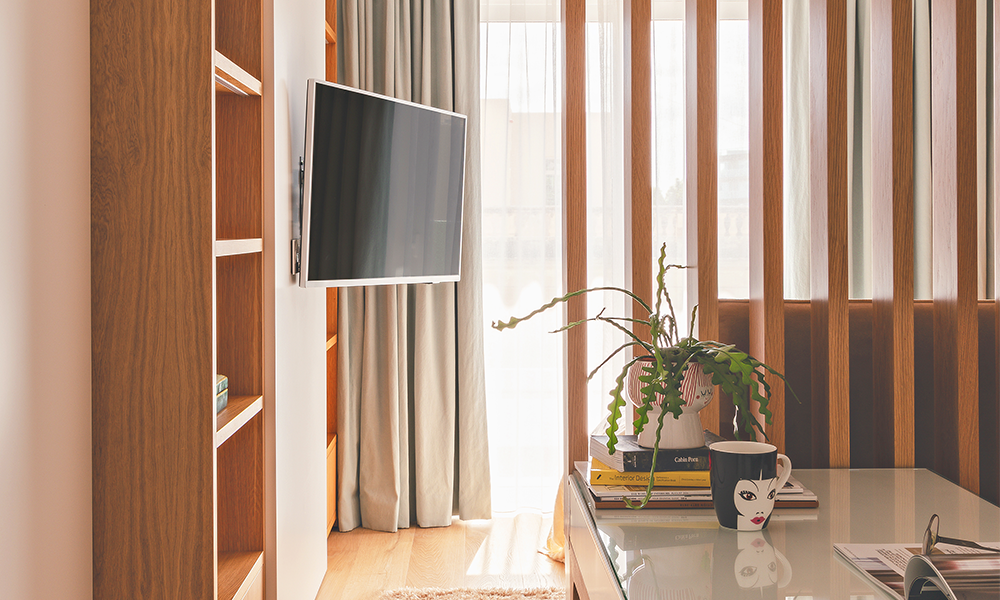
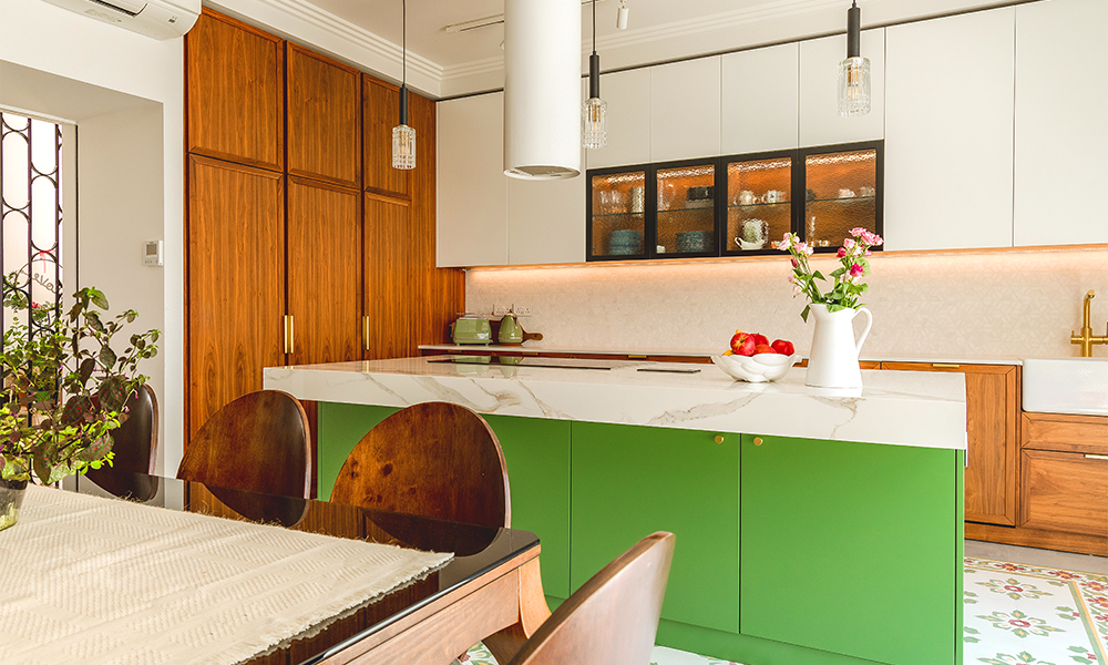
“This kitchen needed to be open-plan and to blend with the aesthetics we’ve got whites and neutral colours.
“But in order to break that up, we also have some glass-fronted cabinets to create interest.
“Then we have the engineered oak flooring which we’ve introduced throughout most of the apartment.
“Then against the white we have included accents via different textures.
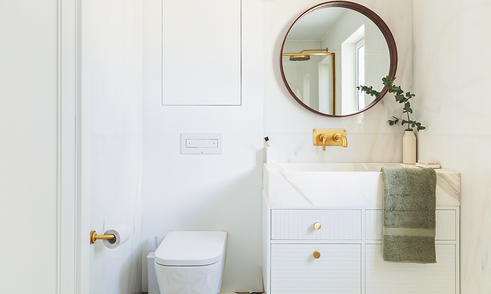
“For example, we were given a healthy budget for the main bathroom so we clad the walls in marble with different shades of white and grey.
“That’s broken up by the vanity unit with its textured front and the bespoke marble sink on top as well as the brass handles and accessories and a timber-rimmed mirror.
“We’re always looking to create balance.”
>> Malcolm added: “Our use of colour and texture depends on the design of the project.
“Here we’ve used brass as it’s the right amount of contrast.
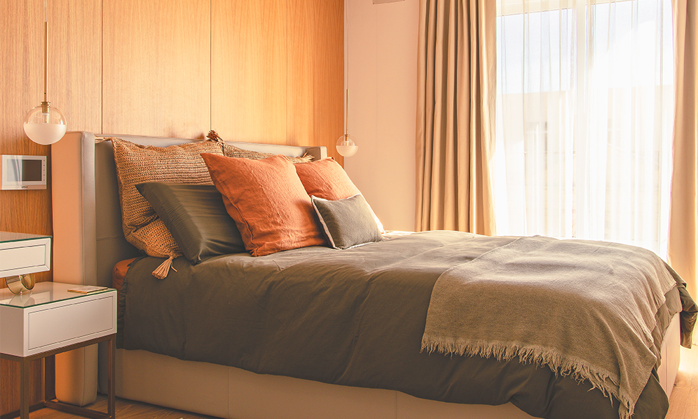
“Chrome and silver are on a different spectrum to brass and bronze – they are colder and white is already rather cold so we can balance that with warmer shades.
“We’ve done similar things in some of the other rooms where the furniture is white but broken up with oak drawers.”
>> Paul said: “Light and lighting are also exceptionally important in our designs.
“We always make sure there is lighting at various levels with wall lights, ceiling lights and inset lights to make sure the space works during the day and at night.
“In this apartment there is a single bedroom that we designed for the owners’ daughter.
“We created a working area as well as a sleeping area, using a visual barrier to divide the space without stopping the natural light from the window from coming into the space.
“It’s a playful area so we were able to bring more colour in here than in other parts of the apartment to add a bit more character.
“We also wanted something a bit grand for the principal bedroom and we continued the oak with panelling up the walls to do that.
“This is linked to an en suite via a glass door to let the light through – here we’re also introducing darker, more masculine tones against the feminine elements in the main room.
“We have a marble sink that mirrors the one in the main bathroom, but this time in a dark grey with a matching floor.
“The idea is again to create a balance.”
>> The final property we’re featuring from Rebirth is a two-room project.
While the company often tackles whole properties, it also takes on the refurbishment of specific spaces to add value to homes.
“This was a kitchen and living room in a duplex penthouse at a residential block in Malta,” said Paul.
“In the kitchen we’ve combined traditional Maltese styles with Scandinavian influences.
“For example, with the units we’re using warm timber tones in a modern approach to Shaker style and creating combinations which are anything but minimalistic, but still aren’t overwhelming.
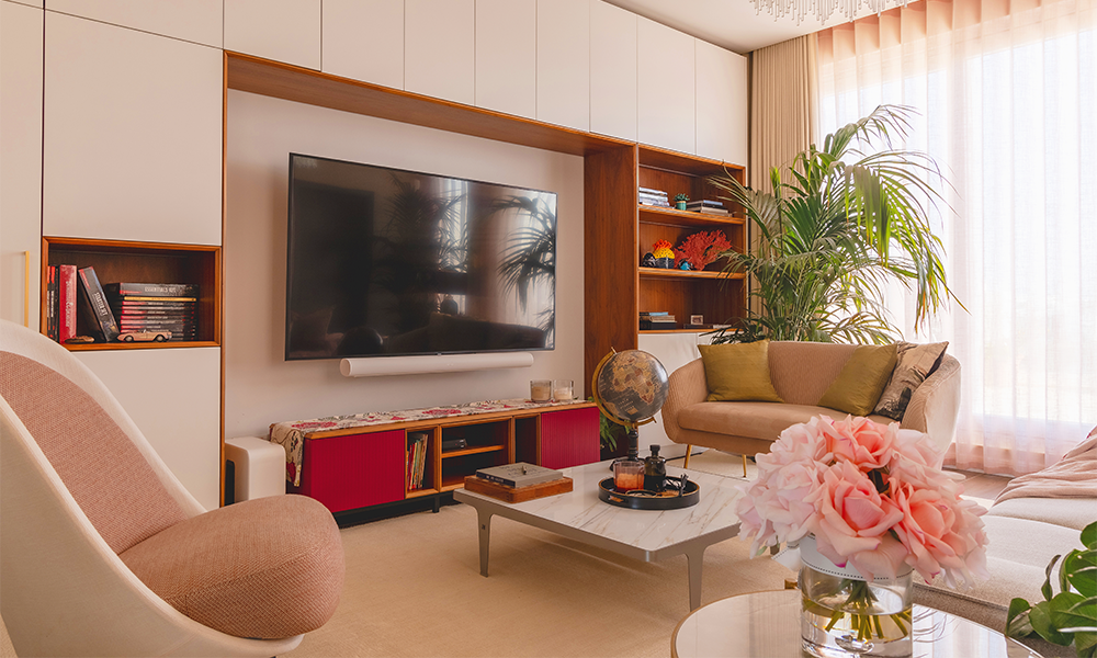
“There’s a modern-looking island unit and a plain matte look for the work surfaces with a marble mosaic for the splash back.
“We’ve included different dimensions of white with elegant coving and green to bring the outdoors indoors to complement the traditional tiles.
“Once again, we’ve made sure there’s plenty of lighting with track lights, pendants and illumination over the splash back.
“It’s a dynamic space that isn’t too much.”
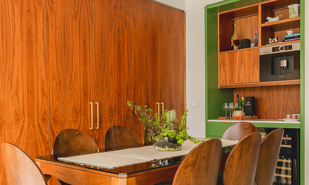
>> Rebirth’s strategy, inspired by the vibrant ceramics on the floor was not to shy away from visual complexity, but rather to frame and contain it within interior elements.
In the kitchen, that meant a wall unit housing a wine fridge, shelving and more plus plenty of display space in the living room.
“The lounge is much more subtle – still not minimalist – but softer,” said Malcolm.
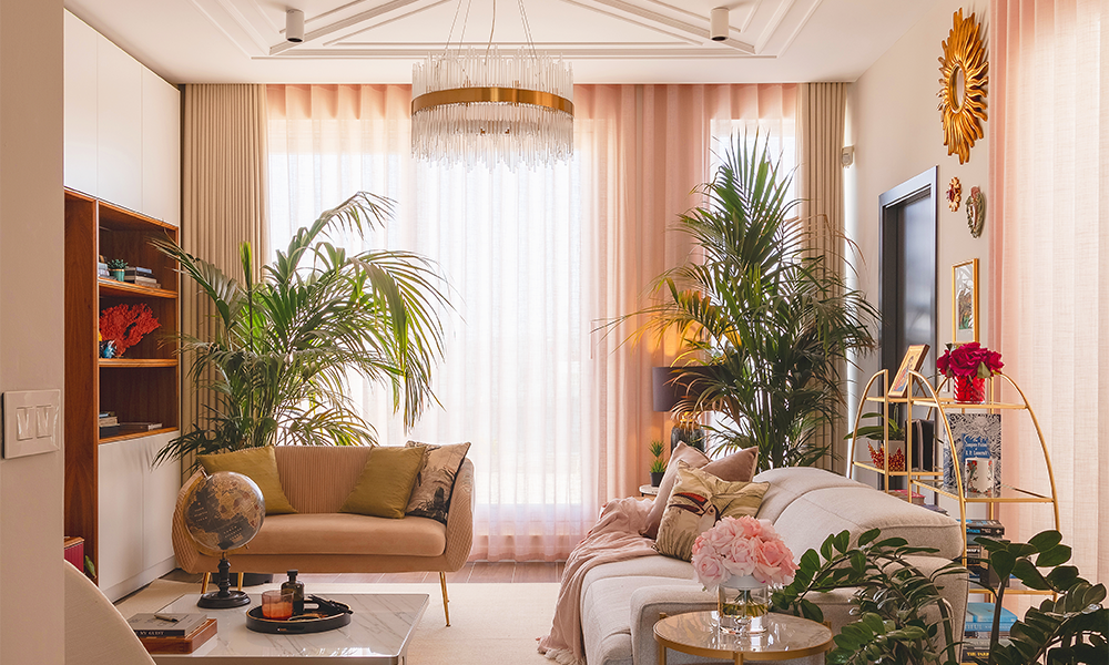
“We’ve gone for white curtains, but we’ve also included plants to make it feel like a garden.
“Once more, we’re blending – the kitchen is perhaps more masculine while the living room is a more feminine space.
“To mix that up we have the black fireplace in the lounge, while the kitchen has the round dining chairs and the floral pattern on the floor.
“There are elements of bold black in both spaces and that helps to make sure that the transition from one room to the other really works.”
>> Rebirth offers a full suite of interior services in London including individual room design and whole-home options.
The firm can handle full renovations including engineering tasks, right through to dressing properties ready for occupancy.
Specialising in refurbishments – hence the company’s name – the company offers everything from conceptual design to detailed drawings and renders, decor and furniture selection and project management.
While Malcolm’s background is in design, Paul is an architect by training, with the pair teaming up five years ago to go into business together.
Full details of all the properties featured and Rebirth’s services can be found here
Read more: How the SS Robin has returned home to begin a new life
Read Wharf Life’s e-edition here
Subscribe to our free Wharf Whispers newsletter here
- Jon Massey is co-founder and editorial director of Wharf Life and writes about a wide range of subjects in Canary Wharf, Docklands and east London - contact via jon.massey@wharf-life.com


