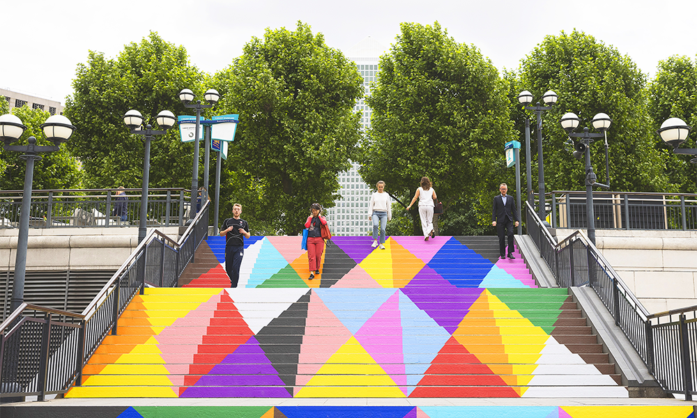
Riverscape

Canary Wharf welcomes artwork by Henry Gibbs celebrating Pride

The artist has used reflective aluminium paint and black dots to create intimate scenes of himself and his friends on walls at Wren Landing
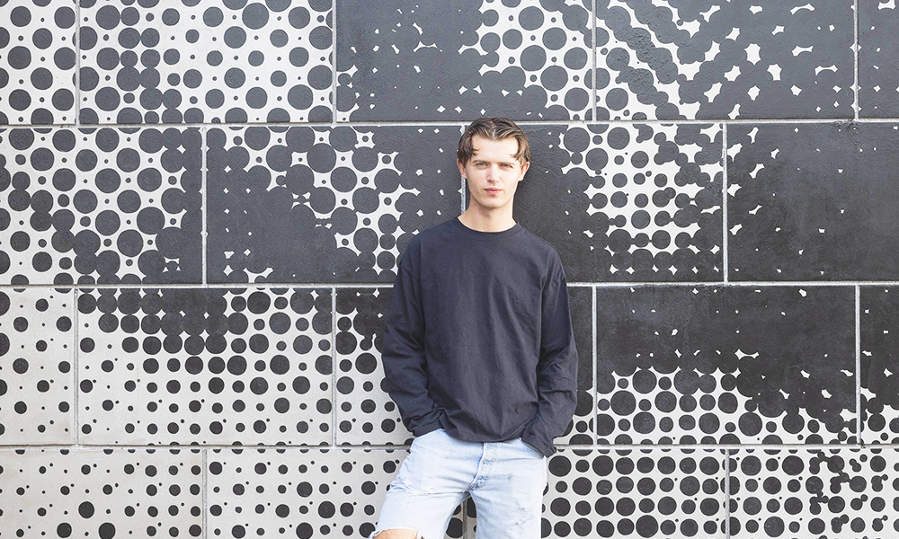
Artist Henry Gibbs stands in front of his mural Get Real in Canary Wharf, a young man in a black top and denim shorts
Artist Henry Gibbs with detail from Get Real in Canary Wharf

Subscribe to our free Wharf Whispers newsletter here

Canary Wharf’s Pride month celebrations generally feature vibrant colours.

From the rainbow pedestrian crossings to the multicolour triangles of Lothar Götz, subtly recalling the abuse of LGBTQIA+ people at the hands of the Nazis.

But Henry Gibbs Get Real, painted on three walls at Wren Landing overlooking West India North Dock, presents a different take on queer relationships and intimacy.

Pass by close up and his monochrome dots may well be incomprehensible – a random pattern in black and white.

But move further away and things start to come into focus. 
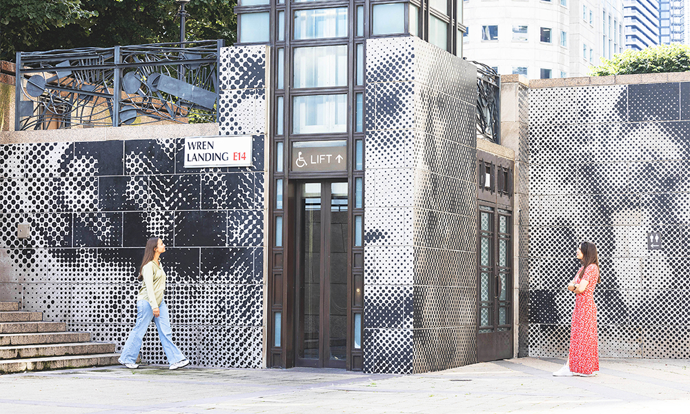
Two women look at Henry's artwork at Canary Wharf's Wren Landing
Passers-by take in Get Real at Wren Landing

discovery in abstraction

“While I was painting it, I hadn’t really comprehended the image because I was very close to it all the time,” said Henry, who spent three weeks creating the work.

“When I felt something from it was when I went over to the other side of the dock.

“That action of taking a step back is when the emotion comes, not necessarily one particular feeling, but really trying to understand something and getting to know it.

“The act of abstraction and including hidden references is a very queer thing. I could say that the dots are a queer abstraction, which is a theory in itself.

“Then there’s the use of colour in the work – I wanted to create something more understated for this commission.

“With the black dots I was thinking about light, so I used aluminium reflective paint as the base, which literally takes light and colour from the sources around it.

“That’s a queer thing in itself, because of the constant change that is being influenced by the painting’s environment.

“The black dots are also like a newspaper-style print and the mural as a whole has this aspect of absorption, which is a reflection of queer identity.

“The aluminium paint will pick up some colour in different lights – at sunset it can have an orange glow and there will be a similar effect at five in the morning as well as the glow of artificial lights at night.”

Henry is the second artist to create work on the estate through Canary Wharf Group’s partnership with Pictorum Gallery, following the unveiling of Lydia Hamblet’s Together, Basking On The South Quay in 2023. 

A recent graduate of Central Saint Martins, he said he’d developed an increasingly mechanical way of painting, having become interested in technology as a medium.
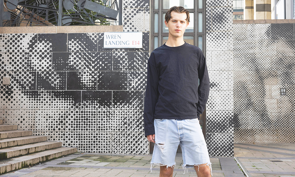
Artist Henry Gibbs stands in front of his mural Get Real in Canary Wharf, a young man in a black top and denim shorts
Henry says the dots he uses create a ‘distorted, abstract look up close’

joining the dots

“I developed this dot technique, using found imagery and photography I do myself,” he said.

“I half-tone and then project them onto a canvas to create a distorted, abstract look up close.

“Then at a distance – or if you view it online – you get a sense of the image that’s there. That’s also the technique I used for the mural.

“The title comes from the film Get Real, which is about coming out in school – it’s quite a raw 1990s movie that was cheaply made but has a real impact and a strong message about growing up gay.

“The painting’s title is also about Jacques Lacan’s psychoanalytic theory of The Real – that your self comes from within and is not influenced by anything else.

“I don’t really believe in coming out, but my real self is found in the images in the work. It features my friends Ed and Tommy as well as me on the thinner wall.

“It references my own queer friendships and intimacies, which have only developed quite recently, so there’s discovery too, which I wanted to celebrate. 

“It’s a strange feeling to have this mural in Canary Wharf. It’s my thing, but it’s also such a public display of the work.

“I would have to go and see people looking at it to understand how that feels – I can’t really imagine it.

“I found the process of doing it very exposing, because there were people watching me doing it. It did feel good to complete it.

“My friends and family all came to the launch and I felt pleased with what I’ve done.

“I’d never been to Canary Wharf before this project, I didn’t know who I’d be working with or where.

“There were a lot of late nights, a lot of work, but we got it done and I feel very accomplished.  
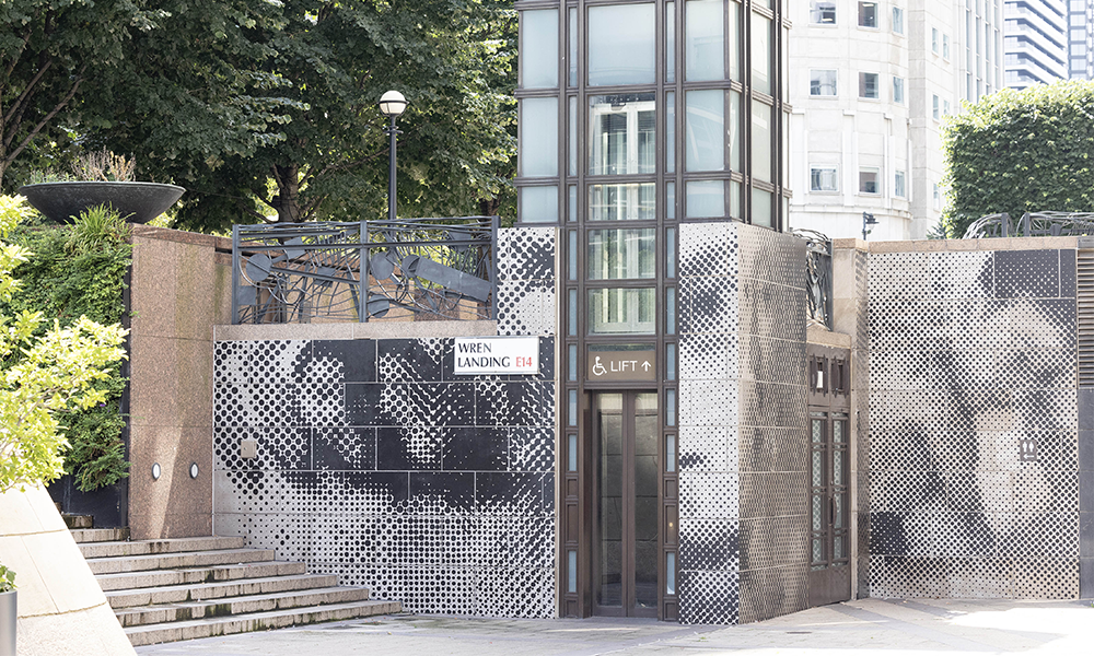
Image shows Get Real from further away with images of men visible in the dots
Viewers can make out images as they move further away from the work

key details: Get Real in Canary Wharf

Get Real can be seen at Wren Landing (between Cabot Square and West India North Dock.

It is a permanent part of Canary Wharf’s public art collection and will be on display for the foreseeable future.

Find out more about the mural here

Read more: How Toby Kidman created a pub with soul at the Pacific Tavern

Read Wharf Life’s e-edition here

Subscribe to our free Wharf Whispers newsletter here

- Jon Massey is co-founder and editorial director of Wharf Life and writes about a wide range of subjects in Canary Wharf, Docklands and east London - contact via jon.massey@wharf-life.com
Subscribe To Wharf Life

Canary Wharf: How Lothar Götz’s works bring depth to Canary Wharf’s Pride Month

Artist’s three installations celebrate LGBTQIA+ culture and achievements across the estate in June

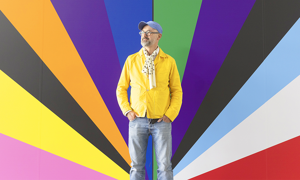
Lothar stands in front of part of his work Electro-Rainbow

Subscribe to Wharf Life’s weekly newsletter here

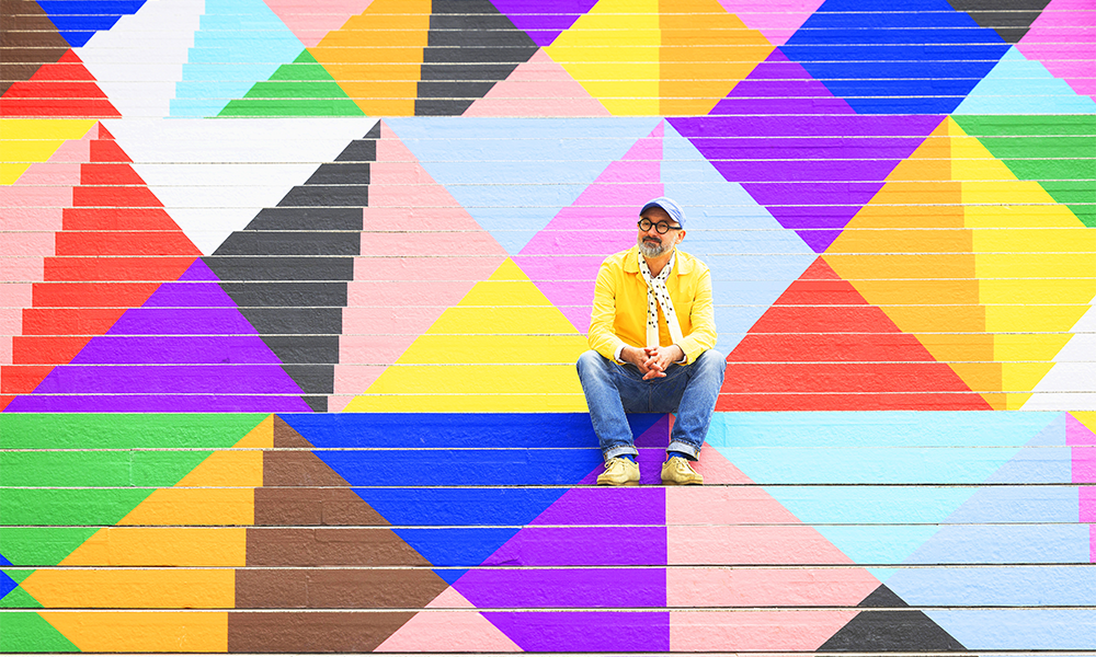
People walking down the Riverside Steps from Westferry Circus may not notice them at all.

Those turning round or going up might take them for a pleasing geometric arrangement of brightly coloured shapes.

Few, it’s fair to say, will immediately associate the pink triangles with the Nazis’ persecution of gay and bisexual men and transgender women.

“They were made to wear pink triangles in the concentration camps,” said artist Lothar Götz, who created the artwork, titled Upbeat for Canary Wharf’s celebration of Pride Month in June.

“When I was in my 20s, we all discovered what happened in Nazi Germany.

“As a gay man, I would most likely have ended up in a camp and that was quite a daunting thing to understand.

“That was why in the 1980s we were wearing pink triangles as a reference to what happened. 

“I like pink as a colour, it’s important to me and very much linked to the gay identity and while I didn’t want to make a piece that singled that colour out, if people notice it as a reference that clearly celebrates the LGBTQIA+ community’s achievements then that is great.”

It’s that broad mission that spells out the scope of three works Lothar has created on the estate after being commissioned by Canary Wharf to mark Pride.

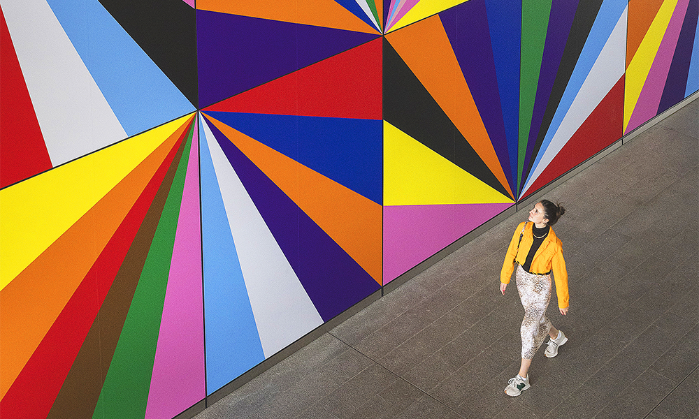
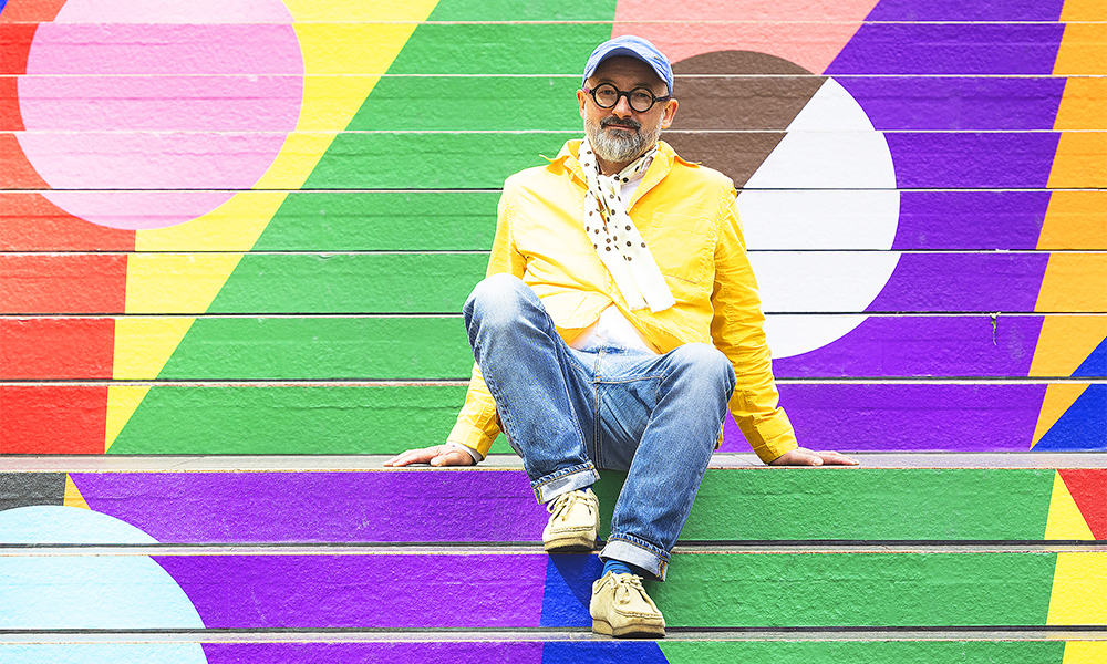
His other two pieces – Jump and Elector-Rainbow – can be found on the Reuters Plaza steps up to One Canada Square and in Crossrail Place.

Lothar sits surrounded by the triangles of his piece Upbeat

All three use colours drawn from the Progress Pride Flag, a symbol created in 2018 that builds on the traditional rainbow to embrace the wider LGBTQIA+ community.

Forest Gate resident Lothar, who works from a studio in Stratford, first visited Canary Wharf as a student when only One Canada Square and a collection of comparatively low-rise buildings had been constructed. 

“That was long before I moved here – there were only a few tower blocks, but it’s always been an area that’s fascinated me,” he said.

“In those days it felt very artificial so it’s interesting to see how it’s becoming more and more lively all the time.

“When I first moved to London and saw Canary Wharf again, I couldn’t have dreamt that it might be a space where I could do a site-specific installation.

“When I was a child, growing up in Grünsberg in Bavaria, I didn’t know the word for being gay – it didn’t really exist there.

“Then later there was the idea of coming out and I didn’t know what that was either – gay culture was something that very much only happened in gay bars. 

“Moving from a provincial town to a city where you could go and actually meet people who were like you was fantastic – that this was normal was such a major achievement. 

“I got married six years ago at Chelsea Town Hall and I found it tough going down those iconic steps – it was so emotional. 

A Wharfer walks past Electro-Rainbow at Crossrail Place

“That you have installations like this celebrating Pride, in places like Canary Wharf, which are associated with power and money  is quite amazing – it’s so important for the whole LGBTQIA+ movement.

“When I was shown the steps and places they wanted me to create pieces for, I honestly couldn’t believe it.

“That it would be possible for me to make work in celebration of Pride in these locations, where people would be going up and down, doing their business and it would be part of normality, well I found that very touching.”

Lothar began his career as a student of aesthetics before moving to London to study painting at the Royal College Of Art.

Inspired by a childhood love of building sites as Bauhaus-style dwellings were erected in the town he grew up in, his work has often related to, or been directly applied to, architecture.

“I found those bungalows especially interesting when they were not finished,” he said. “As soon as they were, they were just living spaces, not the abstract fantasy spaces I’d used them as.

Lotar sits amid his work Jump at Reuters Plaza Steps

“That has informed my later work, including the pieces I’ve created in Canary Wharf.

“I try to highlight the spaces themselves – the steps, for example, are not just functional. With the colours it’s a bit like the effect of a red carpet for a specific event – you change the space and it’s that quality that interests me.

“It’s similar to the way flags and bunting for the Jubilee change a village green into something different.”

Lothar said the quality of the pieces he produced for Pride was of fundamental concern to him.

“I always want to leave how people respond to my works pretty open,” he said. “I wanted to do a series of serious artworks that were somewhere in between being immediately identifiable as works for Pride and simply art in their own right. 

“I think that when you look at them, you notice that the colours are Pride colours, but it was also important to me to say that people aren’t just gay in June. 

“There are still hurdles in life for LGBTQIA+ people – perhaps not as many as there were but they are still there.

“I hope people pause and think a little bit, that I’ve created something that’s subtle. That’s why the darker elements are in the work.

“My work is abstract, but it always has stories behind it. Electro-Rainbow, for example responds to the large panels it is on – the architecture.

“But the kaleidoscope of the colours makes reference to club culture – the dancing, the lights and the colours – which has been very important in the history of gay liberation, particularly in the 1980s and 1990s. 

Lothar's Upbeat at Riverside Steps near Westferry Circus
Lothar’s Upbeat at Riverside Steps near Westferry Circus

Jump is about the jumps in progress that have been made – the steps it is on are quite big but they’re still dwarfed by One Canada Square above them.

“It’s a reminder that as a gay man I still need a safe space because it’s still a big thing to come out, but that there have been these jumps.

“My love and relationship have a completely different level of acceptance now than would have been possible when I had my first relationship.

Upbeat is really a response to the architecture and takes the pyramid on top of One Canada Square as one of its dominant elements.

“But again, you have those Progress Pride Flag colours and the lozenge shapes that are similar to the facade of Newfoundland and the blue and white lozenges on the Bavarian flag, which is where I’m originally from.

“That is an abstraction of the shapes the clouds make.

“With this piece, I wanted to describe the feeling you get when you step off the boat and walk up that stairway to Heaven. It’s very beautiful.”

  • Lothar’s works are on show in Canary Wharf until the end of June, 2022, as part of the estate’s wider celebration of Pride Month.

Read more: Find out how mudlark Nicola White makes art from her finds

Read Wharf Life’s e-edition here

Subscribe to Wharf Life’s weekly newsletter here

- Jon Massey is co-founder and editorial director of Wharf Life and writes about a wide range of subjects in Canary Wharf, Docklands and east London - contact via jon.massey@wharf-life.com

Subscribe To Wharf Life